Saturated Ambition: How America's Elite Are Claiming Jewel Tones as the New Language of Power

Photo by Photo by Prateek Saxena on Unsplash on Unsplash
For decades, the American power wardrobe operated on a remarkably narrow spectrum. Charcoal. Ivory. Camel. Navy, if one felt adventurous. The implicit message was one of restraint — that true authority needed no adornment, that confidence was best expressed through the absence of color rather than its embrace. That consensus is now fracturing, and what is emerging in its place draws from a far older, far richer tradition of chromatic confidence.
From the hand-knotted carpets of Persian artisans to the tilework of Moroccan riads, Middle Eastern design has long understood something that Western minimalism refused to acknowledge: that color is not decoration. It is communication. And a growing cohort of wealthy, culturally attuned Americans are beginning to speak that language fluently.
The Psychology Behind the Palette Shift
Color psychology has been studied extensively in academic and commercial contexts, but the specific meaning attached to saturated, jewel-toned hues carries particular weight when examined through the lens of status signaling. Psychologists who study consumer behavior note that the deliberate adoption of bold color — especially in professional or social environments dominated by neutral convention — functions as a form of what researchers call "costly signaling." The individual who enters a room in a coat of deep Byzantine violet or a jacket in saturated peacock teal is not merely making a fashion choice. They are communicating a willingness to be seen, to be judged, and to stand apart.
This is, at its core, an act of courage — and it is one that Middle Eastern design traditions have encoded for centuries. The rich ultramarine of Iznik ceramics, the saffron and vermillion of Omani embroidery, the emerald greens that recur across Andalusian architectural ornament: these are not accidental choices. They represent a philosophy in which visual intensity signals vitality, prosperity, and cultural fluency.
American consumers with access to high-end markets are increasingly absorbing this philosophy, not as appropriation but as genuine aesthetic education.
From the Wardrobe to the Home
The chromatic shift is not confined to personal dress. Interior designers working with high-net-worth clients across New York, Los Angeles, and Chicago report a marked increase in requests for what one designer described as "rooms that breathe color" — spaces anchored by deep jewel-toned upholstery, hand-painted zellige tile, and textiles that recall the bazaars of Marrakech or the souks of Muscat.
The logic is consistent with that of the wardrobe: a home that dares to use a wall of deep carnelian or a sitting room furnished in layered teal and burnished gold communicates something quite different from the all-white loft that defined aspirational American interiors for the better part of two decades. It communicates a settled confidence — the confidence of someone who has moved beyond the need to signal sophistication through absence.
Luxury home furnishing brands have taken note. Collections that draw explicitly on Middle Eastern chromatic traditions — incorporating the rich terracottas of Moroccan pottery, the lapis lazuli blues of Persian tilework, the warm ochres of North African textiles — are performing exceptionally well in the premium segment of the American market.
The Figures Leading the Shift
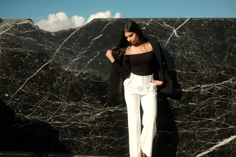
Among the most visible advocates of this chromatic reorientation are women in senior executive and creative leadership roles. There is a particular resonance between the bold palette of Middle Eastern design and the professional ambitions of women who have spent careers navigating environments that rewarded visual conformity. To choose a structured blazer in deep ruby or a draped gown in saturated cobalt is to make a statement that requires no footnote.
In political and diplomatic circles, too, the deliberate use of color as a signaling tool has become more sophisticated. Those with exposure to Middle Eastern counterparts — through business, diplomacy, or cultural exchange — often return with a recalibrated understanding of what color can communicate. The richness of formal Gulf attire, the considered use of color in Levantine formal dress, the ceremonial intensity of North African occasion wear: these are not lost on attentive observers.
The result is a cross-pollination that is less about borrowing aesthetic elements and more about absorbing a philosophy of visual intentionality.
Technique: Incorporating Jewel Tones with Authority
For those navigating this transition from a neutral wardrobe to one that incorporates the saturated hues of Middle Eastern influence, the most important principle is commitment. The jewel-toned palette does not reward timidity. A single accent piece in an otherwise resolutely neutral ensemble reads as tentative; a fully committed look — a coat in deep emerald worn with cognac leather and gold hardware, or a draped silk blouse in imperial purple anchoring a monochromatic ensemble — reads as decisive.
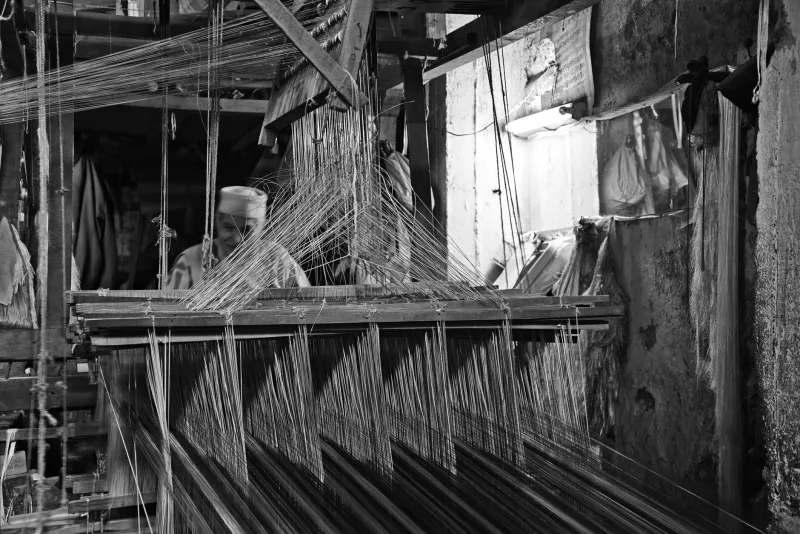
The second principle is quality of material. Jewel tones reveal the character of a fabric with unforgiving clarity. In lesser materials, they can appear garish or flat. In silk charmeuse, hand-woven wool, or fine cashmere, they acquire the depth and luminosity that makes them genuinely beautiful. This is, in part, why the Middle Eastern textile tradition has always privileged the finest available materials: the color and the cloth are inseparable.
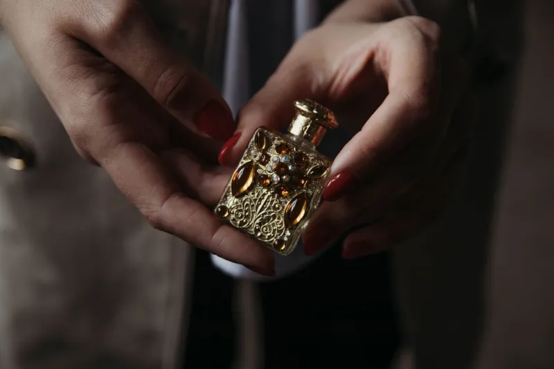
Finally, consider the role of metal. Middle Eastern design traditions pair rich color with gold with an instinctive confidence that Western fashion is only beginning to recover. Gold hardware, gold jewelry, and gold-toned accessories do not compete with jewel tones — they amplify them, lending warmth and anchoring the palette in something ancient and assured.
A Rejection Worth Noting
What this chromatic revolution ultimately represents is a rejection — not of elegance, but of a particular, historically contingent definition of elegance that equated sophistication with restraint and restraint with the absence of color. That definition was never universal. It was not shared by the great design traditions of the Middle East, South Asia, or Latin America. It was not shared by the Byzantine court or the Ottoman palace. It is, in historical terms, a relatively recent and geographically narrow convention.
The American professionals and cultural leaders who are now reaching past it are not abandoning sophistication. They are expanding their understanding of what sophistication can look like — and in doing so, they are aligning themselves with a far longer, far richer tradition of human visual culture.
At Hajar, this alignment feels not like a trend to be observed but a conversation to be continued. Heritage, after all, has always been painted in vivid colors.