Where Ink Ends and Intention Begins: How Arabic Calligraphy Is Reshaping the American Creative Imagination
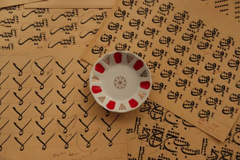
There is a moment in the study of Arabic calligraphy that experienced practitioners describe with a kind of reverence — the instant when a student stops looking at the letter itself and begins to see the breath around it. The space that is not ink. The silence that gives the mark its authority. For centuries, master calligraphers across the Arab world and Persia treated this negative space not as an absence but as a living element of the composition, as carefully considered as the stroke itself.
American creative professionals are now arriving at this same realization — and it is changing the way they work.
The Discipline Behind the Stroke
To understand why calligraphy has captured the imagination of designers far beyond its cultural origins, one must first appreciate the rigor embedded within its tradition. Arabic script is not merely decorative; it is a system of proportion, rhythm, and philosophical intention. Classical scripts such as Thuluth, Naskh, and Nastaliq each carry their own internal logic — a grammar of spacing, weight, and movement that took apprentices years, sometimes decades, to internalize.
The concept of madd, the deliberate elongation of a letterform to create visual balance across a line, and the careful management of kashida, the horizontal extension used to regulate composition, speak to a design intelligence that is fundamentally about control through restraint. Every decision to extend, to compress, or to leave unmarked was the result of trained judgment, not improvisation.
This is precisely what is drawing American designers to the discipline. In an era saturated with visual noise — where digital platforms reward density and immediacy — the calligraphic tradition offers something genuinely radical: a methodology for doing less with greater intention.
New York Studios and the Whitespace Reckoning
Several of New York's most regarded branding and identity studios have begun incorporating formal study of Arabic and Persian calligraphic principles into their internal creative development programs. The motivation, as one creative director described it, is not cultural appropriation but philosophical expansion — a desire to access a visual intelligence that Western modernism, for all its achievements, did not fully develop.
The Bauhaus gave American designers the grid. Swiss typography gave them precision. But the calligraphic tradition, these practitioners argue, gives them something the grid alone cannot: an understanding of how meaning inhabits space rather than merely occupying it.
This distinction matters enormously in practice. When a logo is designed with calligraphic spatial awareness, the negative space around a letterform is not the leftover area after the mark is placed — it is an active, shaped element that participates in the communication. The result is a visual identity that reads with a kind of composed authority, an unhurried confidence that the most discerning clients immediately recognize and respond to.
Architecture and the Breath of a Room
The influence extends well beyond the page. Interior architects working across high-end residential and hospitality projects in cities including Chicago, San Francisco, and Miami are applying calligraphic spatial philosophy to the way they think about rooms.
In traditional Islamic architecture, the relationship between solid wall and open void was never incidental. The pierced screens of mashrabiya woodwork, the arched recesses of iwan portals, the measured rhythm of colonnaded courtyards — all of these were expressions of a design culture that understood negative space as structurally and spiritually essential. The void was not emptiness. It was the medium through which light, air, and contemplation moved.
Contemporary American architects who have studied these principles describe a shift in how they approach volume. Rather than filling a room to establish presence, they are learning to shape the empty portions of a space with the same care they bring to built elements. The result is interiors that feel inhabited by intention — rooms that breathe, that invite stillness, that communicate luxury through what they withhold as much as what they offer.
The Logo as a Letter
Perhaps the most visible expression of this influence is emerging in American brand identity design. A growing number of visual identities developed for luxury, wellness, and cultural brands in recent years reflect a compositional sensibility that owes a clear, if often uncredited, debt to calligraphic thinking.
The tendency to treat a brand mark as a complete visual statement — one in which every proportion, every gap, every curve has been considered in relation to the space surrounding it — mirrors the calligrapher's approach to a single letterform on a vast sheet of paper. The mark does not fight for attention. It commands it through composure.
This is a significant departure from the maximalist visual strategies that dominated American brand design through much of the early digital era. Where previous decades rewarded logos that were bold, layered, and immediately legible at speed, the emerging sensibility prizes marks that reveal themselves gradually — that reward sustained attention with increasing depth. It is, in the most precise sense, a calligraphic value applied to commercial visual culture.
Learning to Unlearn
For many American creatives, engaging seriously with calligraphic tradition requires a form of productive unlearning. Western design education tends to treat space as a problem to be solved — a void to be filled, organized, or at minimum accounted for. The calligraphic tradition inverts this assumption entirely.
Students of the discipline are taught to begin with the space and allow the mark to emerge in response to it. The ink serves the silence. The letter justifies the void. This is not a minor conceptual adjustment; for designers trained to begin with the object and work outward, it represents a fundamental reorientation of creative logic.
Those who have made this shift describe its effects in terms that go beyond technique. They speak of a different quality of attention — a slower, more deliberate engagement with the act of making that alters not only their finished work but their entire relationship to the creative process. The discipline, they say, is not merely aesthetic. It is meditative.
The Hajar Perspective
At Hajar, the conversation between Middle Eastern creative heritage and contemporary American sensibility is not a trend to be observed from a distance. It is the animating principle of everything we consider, curate, and celebrate. The calligraphic tradition, with its insistence that true mastery reveals itself in restraint, speaks directly to the values that define genuine luxury in this moment.
The most sophisticated American creatives are not simply borrowing an aesthetic. They are engaging with a philosophy — one that has refined its understanding of space, proportion, and intentional communication across more than a thousand years of practice. In doing so, they are discovering that the silence between words may be the most eloquent statement of all.